Okay, I have calmed down now- A few days ago, I have experimented with two different mediums- Sharpies, and Charcoal. The other mediums that I present in this post have been done beforehand. However, in order to prove that I have experiment with a few different mediums, I will present older art works that contain different mediums on different surfaces for art. I will say which is new, and which is old, so then you are informed of what is happening.

I attempted to start my prelimnary with charchoal, but I had easily become too frustrated with the mistakes I made. So I decided to focus on making something different. New.


This is the infamous Roosterteeth/Hot Hoof crossover fanart piece I was referring to, in my "Sketches" post. It is so silly, yet so perfect. There are the 6 who particpated in the Things to do in Minecraft series- Hot Hoof, Michael, Gavin, Geoff, Ryan, Ray, and Jack.
I can imagine that Gavin would not listen to everybody's hellish warnings to not anger that very same self acclaimed witch, in real life they met. He provoked her, or him in some manner, or form. Then the witch managed to turn Gavin, and his crew into the choosen sheep from Hot Hoof, for angering him, or her. Michael is Ur-ine (yellow), Gavin is Princeton (purple), Geoff is Orangey (orange), Ryan is Edgar 2 (blue), Ray is Thaddeus the Red (red) and Jack is Tostada (green). All hell would break loose as Michael, Geoff, and Jack would ganged up on Gavin, and beat the bloody pulp of him, Ray would explore with his new body, and Ryan would be in total awe, and suprise.
I attempted to draw the sheeps colours with the face of their owners- it turned out cute, but nothing extraoridianary, yet it's perfect for what it is. Sharpies. New.

Here's another art piece that I talked about in the "Sketches post". The one with the cartoonish ghosts, and Sid Viscious. I experimented with chalk in this one. New.

Who remembers this art piece from posts earlier? No? Okay, then- This is a supposed to be a male model in a leather jacket, and the original picture is amongst the 15,000 other photos on my iPhone. This is old, and I was experimenting with chalk, and pepsi, accidently.

Can I tell you a secret?
Can you?!
Okay, well you better keep it a secret, and not tell anybody else.
Promise?
Well.
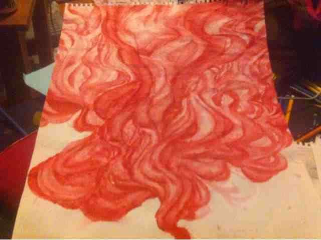
That is my brother's Machine Gun Kelly CD, Lace Up. I decided it would be fun to paint a part of it with Acraylic Red paint. Ahah. I should run, but I have a feeling he does not care as much as he does for his X-Box. Ahah- This is convincing myself that everything will be okay. I would awkwardly, in hope it would go away for good. This is new.

This was for an assignment I was supposed to hand in for Careers. It was my way of representing my results from unit 1. Water colour. This is old.

I really liked what I'd done here with the lettering- This was supposed to be due for an assignment, from last semester. I did not care for how it looked like, before, because I just wanted to have my work done. Now, I think the way I drew each letter is sharp. I like it. Old. Mechanical Pencil.

This is one of the few assigments that involved art work, and I actually finished. Although it was not on time. Here, I remembered I experimented with cursive, brown and yellow watercolour paint, water, dirt, ripping paper and burning edges of this thing I made. I can not remember what it was supposed to be. However, this paper took one hell of a beating from me, and I don't regret it. Definitely Old.

Final piece. Oh pepsi, who remembers this?! Ahah.
This is with Prismacolour Scholar, and well, it could have been better executed. However, the concepts are quite obvious. You see a variety of colours, which I really like about this art piece, and one of the few reasons I still keep it to this day. This art piece was from last year, so Old no doubt.
There you go- I presented you the many artworks that involve different methods, different surfaces, and different mediums.
With charcoal, what I'd enjoy about it that it smudges really easily, so then shading is a lot more of a challenge- which I like. It's very darkening, even against the tone of the tan sketchbook I have. How you use the tool like the strokes, and the technique you use to create those strokes matter a lot, in general.
Except when it smudges very easily, to a place I did not want to smudge on was very frustrating. I did not want it to look messy, but the fact I was using charcoal would be near impossible to be completely neat with this medium.
For sharpies, what I'd enjoy about the permnament markers that they brightly colour like a neon sign. They appear, regardless of what your background is. If you overlay the strokes ontop of one another, then you would definitely noticed if you did, or not; which I quickly attempted to take advantage of.
Then there is the fact that it is permnament. Once you press it against the paper, then it is there forever, which has worried me a bit too much. Plus, if you use the usual stiff nibs, instead of the brush, it will be definitely harder to have more expressive lines for your artwork. Also, the ink would bleed too easy through the paper, which makes it harder for those who use sharpies. What if you want to go all out, but you can not due to the fact that you do not want stain your kitchen table? Then what? Well, that was it like for me.
With Chalk, I found it was a medium that I dislike more than I came to like it. Chalk is frustrating for those who has hard strokes, so it is a struggle to shade nicely. It is hard to define details in smalll art works. Also, your hand would gradually turn the same colour as your hand. If you had black paper, then you could have incidently smudge the paper. Other then those things, Chalk can be a
medium I would like if it was not so frustrating.
Acraylic Paint is one of the mediums that I use often as watercolour paint. I like painting, especially with acraylic. As it dries, everything you did with the paint is apparent on your medium, especially the shade of red I used. If you layered it, then the paint would dry out with form, some of painted parts have bumps, and others are flat; like land. Indeed, the paint remains unlike watercolour. Although I wish the paint can be layered more thicker, and opaque with one layer. Other then that, Acraylic Paint is a medium I've enjoyed.
Watercolours. Beautiful. It is a medium that requires your time, and effort to be slow, and gentle with the consistance, and the how much water you use. Every time I use watercolour, I can just stare for hours at how beautiful it appeared. It's ending appearence is what keeps me to use watercolour. However, fhe fact that it requires little direction of your doing- it is you who is painting, not the paint. Yet there has to be a balance with it. I don't think you understand if you have not use watercolour before, otherwise it appears that I am rambling.
Ordinary pencil is another favorite medium of mine. It is simple, cheap, and darkens quite nicely on your medium. Wood, paper, canvas- it does it's job.
Nevertheless, if you darken with the pencil too much, then it have a glare. That is the one thing I not ever liked about ordinary pencil.
Thin tip marker is perfect for lettering, cursive, swirls with many thin lines, or anything in that relation. If you were to use it for filling large gaps, it would cost less if you use larger size markers. That is what I'd recommend.
Finally, pencil crayons are a neutral medium for me. I love all the vivid colours that come with pencil crayons. Anyhow blending is a problem for me- I do not know how to blend, to be honest. It is still a mystery to me.
Watercolour, and pencil crayon work together. A hazy, soft colouring will be the result of these two mixing together. I'm a fan of soft, smoke-like art.
Watercolour, and dirt work together. It results in a grunge-like texture of the art work. Old, dirty, and anicent. Getting messy is what I like.
Watercolour, water and pen work together. If you place watercolour first, it dries, then pen, it dries, then water, the ink, and watercolour will blend a little together. Depending on colour the ink is, it would be a more vivid shade with the colour, or to be more darker with the colour, or to simply mix colours. Either way, I think it is a cool mixture of different yet related mediums, if you will.
My tired mind can only think of these 3 at the moment.
No comments:
Post a Comment